Showing posts with label Concept Sketches. Show all posts

Saturday, 24 May 2014

White Wednesday - Short Film (Environment and Lighting)

This post is about the concept sketches of the environment as well as the CG lighting for the sunset setting for the courtyard scene that I have created for the short film White Wednesday.

Assets Concept Sheet, Anzel Rossouw, 2013
The Assets Concept Sheet on the left are a few silhouettes that I created to get an idea of how some of the environmental assets would potentially look like. I kind of focused on the street lamps as they would help to bring across the look and feel of an European town.


Environment Concept Sheet 01, Anzel Rossouw, 2013
The image on the left, illustrates the determining visual setting for the environment as a guide for the look of the film. The environment setting of White Wednesday, takes place within a European city on a hill; so the buildings would be very compact and would not be on the same level.


Environment Concept Sheet 02, Anzel Rossouw, 2013
I looked at cities all across Europe but particularly Salzburg, Tallinn and Venice. I mostly focused on the shape of the buildings so that it would have a good silhouette especially when it is placed within the background. I then focused on the windows, roof tops, as well as other assets that would be found on these types of buildings.

The style of the buildings were meant to be very simple such as blocks with sharp edges. These buildings were deigned to be created at a very low poly count to maximize the processing power of the Maya scene. By minimising the poly count, there would be less chugging in the scene and animation becomes easier and faster to create. Imagine having a hi poly object such as a house but then duplicating and placing it all around the scene to create the town; now that would make your scene slow to move around in. So these concept sketches are simple to create very low detailed houses.

Courtyard Sunset Camera 01, White Wednesday, 2013
Courtyard Sunset Camera 02, White Wednesday, 2013
The two images above illustrates the CG lighting that I have created for the Courtyard scene within the short film White Wednesday. The images above are renders taken within the Courtyard scene of the film with same lighting but taken different cameras to show different perspectives. The lighting in this shot is created for a late afternoon setting; at sunset. This lighting was created by using Autodesk Maya through using directional, area and spot lights.

In the end we decided to go with someone else's sunset lighting that they had created for this same shot for the film. Even though the lighting that I created in the shots above are not used within the film, is still think the lighting turned out really great.

Friday, 23 May 2014

White Wednesday - Short Film (The Pigeon)

This post is about the concept sketches as well as the 3D model of the pigeon character that I have created for the short film White Wednesday.

The director of the short film White Wednesday, Rebecca Lyons Wright, wanted the pigeon to look like a clay pigeon as opposed to it being a real pigeon. She wanted the style of the character to be quite cartoon like to fit with the rest of the short film's style. She wanted the character to look unrealistic and she wanted the character to look like he would belong in children's television program.

Pigeon Concept Sheet 01
The first concept sketch to the right was created to illustrate what the pigeon might look like in the short film. The aim was to create at a very cartoon like style to fit the style direction that the film. I looked at movies such as Disney's animation, Bolt and Pixar's short film, Bird on a wire.
Pigeon Concept Sheet 02


The second concept sheet on the right was created to illustrate how the the pigeon might look like in a more realistic approach. I mostly looked at real images of birds as well as the movie Valiant for other reference as I didn't want the pigeon to look too realistic.


The concept sketches that I created for the short film White Wednesday, was really interesting and fun to work on. One of the mistakes that I have done with regrades to the concept sketches was that I focused too much on creating the head that I did not spend time on creating a body but the heads do look pretty awesome.

Rebecca Lyons Wright
The image above is illustrating the concept sheet that we ended up using which was created by Rebecca Lyons Wright; to create the the Pigeon character.

When I started modelling the character I looked at different images as well as video clips of birds as reference but mostly pigeons in particular. I looked at each part of their body, to see how they move around and what they look like; even images of their anatomy really helped me to understand how I should approach the model. I had to think about how everything would work once it came to animating him to avoid things like stretching. I created the hi poly 3D model within Pixologic's 3D sculpting program ZBrush, through using the reference together with the concept art. Getting the basic form of the body was fairly easy but getting down to the very detail was the fun part. ZBrush makes it so much easier, faster and much more fun to sculpt. The only draw back was that I needed to go through the process of retopologizing, but you create a much better and effective model in the end. I created the textures through using the polypaint function within ZBrush which makes texturing more accurate and you are not creating many obvious seams in your textures. Polypaint makes texturing faster, especially with the unwrapping tools in ZBrush.

Pigeon Breakdown Shots
The image on the right, Pigeon Breakdown Shots, illustrates the three steps that I went through to create the hi poly pigeon model. The first render is showing the block out of the model that was created using ZSpheres in Pixologic's 3D sculpting program ZBrush. The second image is the finished model with a basic MatCap Red Wax material. The last render has been fully textured.
Hi-Poly Pigeon

The image on the right, Hi-Poly Pigeon, illustrates three render taken to show different angles of the pigeon character once the character has been fully modelled and textured. At this stage the character looks great but because he is hi poly we wouldn't have been able to use him for animation purposes. He has too many polygons this would cause problems; so therefore we needed to reduce to poly count by making him a low poly character. through the process of retopologizing. Below are images that shows what the low poly model looks like compared to the hi poly model.

Low-Poly Pigeon
I then imported each section of the pigeon into Maya to retopologise the hi-poly sections of the character in order to create the low-poly character. The image on the left Low-Poly Pigeon, illustrates the pigeon character after he has gone through the retopologise process.
Low-Poly Pigeon Wire frame


The image on the left Low-Poly Pigeon Wire frame, is an image that shows three different renders that I have created of the pigeon in order to illustrates the pigeon character's polygons that he has been made out of in his low-poly form.
Low-Poly Pigeon, Blend Shapes


I then created the blend shapes which allows the character to blink, smile and create different facial expressions. This adds life to his face and brings across his emotions during animation. I used Pixologic's 3D sculpting program ZBrush to create these. Creating them was fun and I would have loved to create more; you can never have enough and they create a better animation.


The pigeon character was rigged by Matthew Tolcher. The rig allows the 3D model of the character to be animated. The video above is a short animation of the pigeon flying. The video is showing a breakdown of the rig as well as steps that he has gone through to achieve the final shot that is used within the short film.

Tuesday, 20 May 2014

Robo_Crane

Robo_Crane, Anzel Rossouw, 2013
Robo_Crane is a 2D artwork consisting of a crane bird that has been integrated with mechanical pieces, that lives within the tree tops where the sunlight breaks through the leaves. This artwork was created using Adobe Photoshop. Robo_Crane was meant to be just an inspirational wallpaper for my desktop computer. So that every time I would look at it, it would give me inspiration and hope. I wanted to create a artwork that would bring across my personality, something that would be me in a sense; my style. This artwork turned out to be exactly what I was looking for; it is creating the exact effect that I wanted to create; inspiration.

Robo_Crane, Initial sketch
The image, Robo_Crane, Initial sketch, on the left is the base for the artwork; so the concept sketch for the idea that I had. The sketch was originally done on a plain grey background, but I decided to add a frame and some shading to the background to make it look more interesting.

This one just started off with this line that I drew out of frustration and so my imagination ran off with this idea of creating a mechanical bird; it kind of just started flowing into something amazing.
Once I had a really good solid base I needed to get some details right, such as how the mechanical parts would look like or whether the bird's proportions were correct.

So I started looking at reference images of the different types of cranes that you get as well as their anatomy, in order to gain a really good perspective on how they work and how sections fit together. I looked at how their beaks looked in particular, how it would fit together with his head and I had to consider how I would incorporate those mechanical pieces. For that I looked at machinery with similar capabilities and functionality. Getting ideas about what kind of hinges and other metal pieces would work as well as how wires would fit in. On the neck of the bird I have incorporated some sort of armoury and the feathers on the head turned out to be more metal like than organic.

Robo_Crane, Colour block out 
So once I've fully created the base of the image and I was sure that I was happy with it, I had to start looking at the colour scheme that I would be using. So far through my artworks I haven't really been very versatile when it came to the use of colour. Choosing the colour was quite difficult. The first colour scheme that I considered using was one where I would use very vibrant colours that would be bright and colourful and this meant the use of colours such as reds, yellows, greens, blues; the usual tropical bird colours. The other colour scheme that I had in mind was the one shown in the image, Robo_Crane, Colour block out; the one I eventually used. Pinks, peach colours, purples, a orangey reddish colour that would work quite well with the peachy colours as well as blues to fit into those purples. I had to be careful as to where I would use the colours so that the image would have a good flow throughout the whole canvas. Through using the orange colour next to the blues; I was creating some contrast where I added this warm and cold colour together.

The next step was to add shading to the very flat block out colours that I have used in, Robo_Crane, Colour block out; where it illustrates the colour scheme. On the left I have included an image to illustrate the artwork once I have finished all the shading.

Robo_Crane, Shading
When it comes to shading, you have to know where the source of your light is in order to determine where you would make use of lighter shading as well as the darker shading. Consider what the fall off of the light would look like on your image. You also have to think about what shape you are using. The light would look very different on a flat surface as opposed to a rounded shape. These are the types of things I never use to consider. Once you think about these things shading becomes  so much easier and you have a much better result, this could also help with creating a more realistic artwork or you are just simply able to create the effect that you are aiming at.

For most shading work that I did, I just took a lighter shade of the colour that I was using, for where the light was shining on the section that I was shading, and the darker shade of my colour for the places where I would find shadows; where the light is does not really shine as bright as well as the places where there was a fall off of the light. I also had to consider the colour of my light as well and how that would affect the colour of my lighter shading. The colour of my environment also effected my shading as well as how the base colour would appear as the leaves around the bird would also contribute some light and would therefore effect the colour.

Robo_Crane, Effects
Looking at Robo_Crane, Shading, I decided that the colours looked way too washed out, so I then added some effects that would make the colour brighter and stand out more. I added some levels in Photoshop to bring those colours out more so that the colours wouldn't look as washed out and almost pale in a sense. Looking at the image on the left, Robo_Crane, Effects, you can see how this have made a huge impact. Especially when I considered on what effect that the bright sun light would have on the whole image. How the leaves around the bird would be more illuminated and how everything should be brighter. The image just looks so much more beautiful and way more vibrant. It feels so much more inspiring and uplifting than what it looked like before in the image Robo_Crane, Shading.

I wanted the background to reflect on the bird itself; a place where he would belong. Above in the tree tops of the forest just seemed so fitting. Even though the bird is integrated with mechanical parts, he is more organic than mechanical. The tree tops is a place where he belongs and where he feels inspired. This is his home.

So far this is my absolute favourite piece of 2D digital art. This artwork reminds me that I am capable of so much more; looking at previous art works and comparing it to this artwork shows me progress. To me this artwork symbolizes strength, peace and beauty. Every time I look at this image, I feel inspired and that is what I wanted to create; that feeling of inspiration. When I look at this artwork I want it to reflect my style of painting. It needed to be something that is truly mine.

Monday, 19 May 2014

Female Robot

In my first year of my Advanced Diploma of Screen and Media; at the Academy of Interactive Entertainment (AIE); one of my assignments that I was given was to create concept sketches, model and rig a 3D character. I decided to create a female robot character as this is something that I've always wanted to create.


The video above is a render that I have created to display my very first attempt at creating a 3D character.

Female Robot Concept, Anzel Rossouw, 2012
The image that I have included on the left is the initial concept sketches that I created for my female robot character. I used all kinds of different reference images, ranging from cyber robots to machinery items. So when I started off with these concept sketches, I started looking at human female anatomy in order to get the form and proportions correct; as I was trying to create a fairly realistic female robot character with an interesting design. At that time I haven't had much experience with creating and concept sketches for characters; so I didn't really spend too much time on thinking about how the character would move or whether she would be structurally sound, or any of those considerations. There are however so many elements of the design that I really love; such as the use of negative spaces which gives the character a really strong silhouette.

Female Robot Silhouette, Anzel Rossouw, 2012
The image included on the left; is illustrating the silhouette that I have created for the character in order to gain a good strong perspective of the shape of the character; whether it is a shape that could be distinguished easily, one that is interesting and it is also very useful in identifying sections that could be improved upon, such as structural defects.
Female Robot Colour Concept, Anzel Rossouw, 2012

The image that I have included on the left was created to illustrate the colour scheme that I wanted to use as well as the materials and textures that I wanted to apply to my female robot character.

I mostly wanted to use different shades of grey for the basic colour of the body, because of the wide metallic range of materials that I wanted to use. I also wanted to bring some black, white and blue colours into the metal material in order to emphasise some sections of the robot as well as bringing some verity into the metal materials being used. Through adding colour schemes to my character concept sheet, I was quickly able to see what would work and what wouldn't; this saves time when creating the actual materials and texture maps for the 3D model.


Although this turned out pretty good for a first attempt; I have decided to recreate this character as I believe there are some really good ideas to this design. I am currently redesigning a few parts; especially her legs, as there are some major flaws which I only discovered once I started rigging my character. My skills as a concept artist has increased quite a bit, therefore I believe I can really take this character a lot further than I have before. I have really progressed within my modelling skills; so with a bit of effort this could become a fully functional robot and my goal is to get her to the stage where she is fully rigged and then I would be able to create a short animation with her. I look forward to finishing my next attempt and I know I could do better.

Friday, 16 May 2014

Holographic Fashion - VFX Short Film (Concept Art)

These concept sheets that I have included below are a part of the short film Holographic Fashion. These sketches have been used as the holograms within the first shot of the short film that I am interacting with.

I just want to talk a little about how I created these concept sketches.

Dress Concept Sheet 1, Anzel Rossouw, 2013
On the left of the screen I have included Dress Concept sheet 1, as well as Dress Concept sheet 2. In these two concept sheets, I want to illustrate how the dress designs look without the hologram effects. I wanted to show the initial sketches as they are, on white paper. These concept sketches were created using Adobe Photoshop just like my previous concept art.

As these concept sketches were meant to bring across an idea as to what kind of fashion would be followed within the future, I wanted to create weird and wacky clothes; a fashion that is futuristic. As the short film is about a fashion designer I wanted the designs to be elegant and almost a little bit formal.

Dress Concept Sheet 2, Anzel Rossouw, 2013
At first I started looking at unusual fashion, like those that would be modelled on catwalks; so designers items. Even the fashion that would be worn by our unusual music artists like Lady Gaga.

These designs gave me a great direction to head towards, but it still didn't feel like it was enough, it wasn't quite bringing across the futuristic effect that I wanted to emphasise. So I started looking at abstract art. I gathered some seriously great shapes and put that together with the most interesting fashion designs that I could find. I even used the reference that I have gathered for my environment of the futuristic furniture, within the dress/clothes designs.

Hologram Dress Concept Sheet 1, Anzel Rossouw, 2013
On the right of the screen I have included the two concept sheets Hologram Dress Concept Sheet 1, as well as Hologram Dress Concept Sheet 2. These concept sheets are used to illustrate how the dress designs shown above, would potentially look like with the hologram effects added to them.

These concept sketches shows the colour direction, to see which colour to use for the dress design holograms as well as the intensity of the glow that we were aiming for in the finished film.

Hologram Dress Concept Sheet 2, Anzel Rossouw, 2013
I created the glow effects using the Gaussian Blur filter with a duplicate of the concept sketch layer, within Adobe Photoshop. that way the initial layer that has not been blurred is creating that sharp outlines and the blurred layer acts as the glow of the outlines.


Hologram Concept Sheet, Anzel Rossouw, 2013
The concept sketches that I have included on the left, are all the sketches that I have created in order to illustrate to hologram controls that is used within the first shot of the film like the dress designs above.


Tuesday, 13 May 2014

Holographic Fashion - VFX Short Film


Holographic Fashion is the combination of holograms and fashion design. The idea was to create a futuristic film in which I was a fashion designer in the future where the screen I am working on is a hologram.

Holographic Fashion was part of a visual effects assignment within my second year at the AIE where I worked with another student, to create a featured film. For this assignment we incorporated a 3D scene with filmed footage of myself and gave I then added some visual effects to create the holograms using Nuke from the Foundry.

The 3D scene was created in Maya in which I modelled, textured and lit the environment before rendering it. Using Nuke I composited the 3D scene together with the footage and gave the film effects using our dress designs as well as our screen designs, which was created in Photoshop.

I learnt so many thing s​and had lots of fun creating this film.This was an amazing experience. I hope you enjoy watching it.

Tuesday, 6 May 2014

Fireflies - Short Film


When I was studying at the Academy of Interactive Entertainment (AIE), at the Canberra Campus here in Australia in 2012; I had the opportunity to work with a group of students, where we had to create a short film as part of our first year final assignment. We ended up being eight students; where we only had about two months to create this short film.

This short film is about two fireflies that falls in love within the sun set of the swamp. The Fireflies Short Film created by 8 students in the Advanced Diploma of Screen and Media over 8 weeks.

The process of creating a film always starts with getting a story board together with a good solid storyline. So we came together as a group and brainstormed a few ideas for the short film. The inspiration for our short film originally came from the song Fireflies by Owl City. 


We wanted to create a short film about fireflies as being sung in the song; instead we ended up with a comedy/ romance story about two fireflies in a swamp.

The style of this short film was aimed at being a very cartoon like/ fantasy style, almost the same type of style that could be found in a Disney film, so a non-realistic film. So the next step was to start concept sketches and creating an storyboard which also meant blocking out the basic poses of the animation with block models. I was initially the environment concept artist for the short film.

Tree Concepts by Anzel Rossouw 2012
I have included some of the concept sketches as well as color swatches that I have created in Adobe Photoshop, just to get an idea of what the environment could potentially look like. I ended up looking at the Disney movie, The princess and the frog, for some ideas of how the swamp could look like, as well as looking at many images of swamps in America and what kind of vegetation are found in those locations. Looking at the style of my trees, I had quite a bit of influence from the styles that Tim Burton uses in his movies.

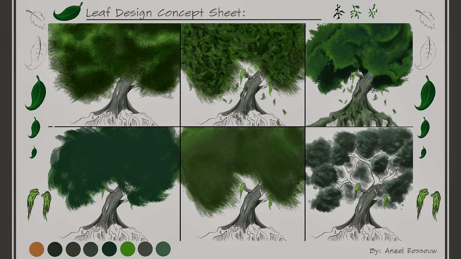
Leaf Concepts by Anzel Rossouw 2012
After getting the style of the trees right, I started creating some leaf designs. Looking at different color schemes of greens as well as the types of leaves and what they would look like on one of my tree designs. Before these sketches I've never really attempted creating environment concept sketches/ art, so it was pretty new to me to get the leaves to actually look like leaves; to get the ideas in my head into a visual representation. So this was a bit of a challenge for me.

Environment Layout Concepts by Anzel Rossouw 2012
I then tried incorporated these trees together in a landscape form; where I would be able to gather a good idea as to how these trees would look together when added into the environment with water and some other environmental assets. I wanted to see whether these trees would fit into a swamp environment as it isn't really your typical swamp tree.

Environment Concepts by Anzel Rossouw 2012

On the right I've included some of the very basic designs of the environment assets that could be found within swamps. I looked at many swamp images as references and looked at the vegetation that are found in these very moist areas. I found that plants such as ferns and lily pads as well as vines on the trees are very common in these areas. I also included a bit of a color scheme of a range of green colors that could be used.

Lighting Concepts by Anzel Rossouw 2012

This short film takes place within a sun set lighting, where at the start of the film it is in a late afternoon time of day, where it then progresses through to the end of the short film where the film ends at a night setting. The lighting concepts that I created has been included on the left where I have illustrated the progression of the stages from late afternoon to night, through the film together with color swatches of what the lighting might look like.

Below are two rendered images from scenes 8 and 9 from the short film where I did layout, created concepts as well as created the CG lighting and then composited the different render passes together with some paint overs. These were done using software programs such as Autodesk Maya for the layout of the scene and the lighting as well as Adobe Photoshop for the basic composition. Even though I created the trees concepts, the modelling of the trees were split between me and another student and many of the environment assets were created by some of the other students. These assents were created using the program ZBrush by Pixologic and Autodesk Maya. Unfortunately the shot shown below in the second image from scene 9, does not appear in the film due to complications when we were rendering, but I still think is turned out really great.

"Scenes 8" Lighting, Layout, Concepts and Composition by Anzel Rossouw 2012

"Scenes 9" Lighting, Layout, Concepts and Composition by Anzel Rossouw 2012
I'm really proud of this short film and think that for first year students, we did a pretty great job for the knowledge that we had back then. Although when I look back at it now and compare it to work that we have recently created, I find that we are capable of so much more now. We have learnt quite a bit since then. I know I have definitely improved, and all it needs is practice and more experience. I still think for a first year assignment, considering how many students we were and how much time we had; we really did do a great job and it turned out to be a great short film.